


Improve the ticket2.com web page
Improve the ticket2.com web page
Improve the ticket2.com web page
Ux/Ui Design
Ux/Ui Design
Ux/Ui Design
Project Overview
Want to work together?
Nshteh01@gmail.com
If you like what you see and want to work together, get in touch!
Ticket2 is Sweden's secure marketplace for the secondary trading of event tickets. Their goal is to ensure that the process can be as safe and smooth as possible for both buyers and sellers.
The company offers tickets to a wide range of events around the world.
Design: Redesigned the website and improved the user experience
User Research: Conducted surveys, interviews, and competitor analysis. Analyzed data to identify target groups and their needs, creating two behavior types to better understand the target groups.
User Story Mapping: Created user story maps to organize and prioritize the project's targeted functionalities. This encouraged collaboration, made sure that needs were understood, and helped with the scheduling of releases.
Flowchart Creation: Created flowcharts to show the customer's path while buying a match ticket
Prototyping: Created prototypes in Figma, starting with low-fidelity (low-fi) and then progressing to high-fidelity (hi-fi) prototypes based on research insights to test design solutions and receive feedback from users.
User Testing: Conducted tests with five participants who expressed their opinions and sentiments on the prototypes and tasks.
Collaboration: Worked with the development team to ensure the design met research goals and was correctly implemented.
Lack of Trust: Users did not trust the old website, which negatively impacted their willingness to use the platform.
Poor Usability: The website was difficult to navigate, making it challenging for users to find and purchase tickets.
Lack of visual appeal: The design of the app is not visually appealing, and it does not engage users.
The changes made to the Ticket2 website greatly improved the user experience. The new navigation is easier to use, making it simple for users to find and buy tickets. The updated design looks more professional, which helps build trust with users. The checkout process is now faster and simpler
The changes made to the Ticket2 website greatly improved the user experience. The new navigation is easier to use, making it simple for users to find and buy tickets. The updated design looks more professional, which helps build trust with users. The checkout process is now faster and simpler
This case study shows how important it is to focus on user experience for online platforms. By understanding what users need and want, Ticket2 was able to redesign its website to be more user-friendly and trustworthy. This project highlights that ongoing user research and design improvements are key to the success of an online ticket marketplace.
This case study shows how important it is to focus on user experience for online platforms. By understanding what users need and want, Ticket2 was able to redesign its website to be more user-friendly and trustworthy. This project highlights that ongoing user research and design improvements are key to the success of an online ticket marketplace.
Surveys: Surveys were conducted to get a better understanding of the user's pain points
Competitor Analysis: To find best practices in the industry, a UX analysis of other websites was carried out.
User testing: The website was tested with a sample group of users to observe their behavior and identify areas for improvement.
Trust Issues: Users reported feeling insecure about using the old website due to its outdated design and lack of clear security features.
Navigation Difficulties: The old website’s navigation was not intuitive, leading to frustration and difficulties in finding tickets.
Attractiveness: The users found the current design of the website to be unappealing and lacking in visual appeal.
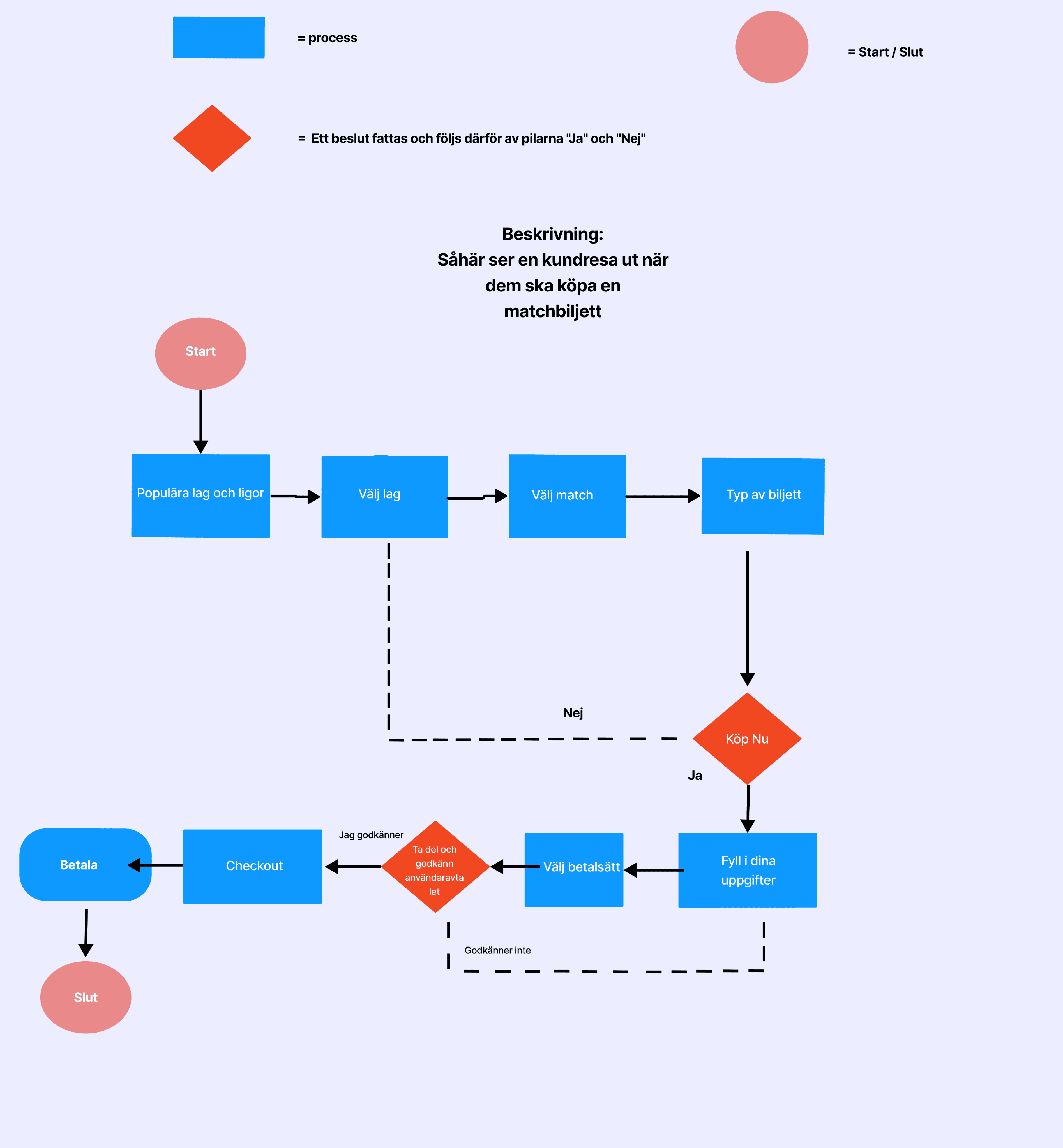
During this phase, i created flowchart. The flow that was scheduled depicted what a customer journey looks like when they are purchasing a match ticket.
Redesigned Interface: Developed a new, visually appealing design that instills confidence and trust in users.
Improved Navigation: Simplified the navigation structure, making it easier for users to find and purchase tickets.
Responsive Design: Ensured the new design is fully responsive, providing a seamless experience on both desktop and mobile devices.
Problem Identification
Problem Identification
Conclusion
User Research
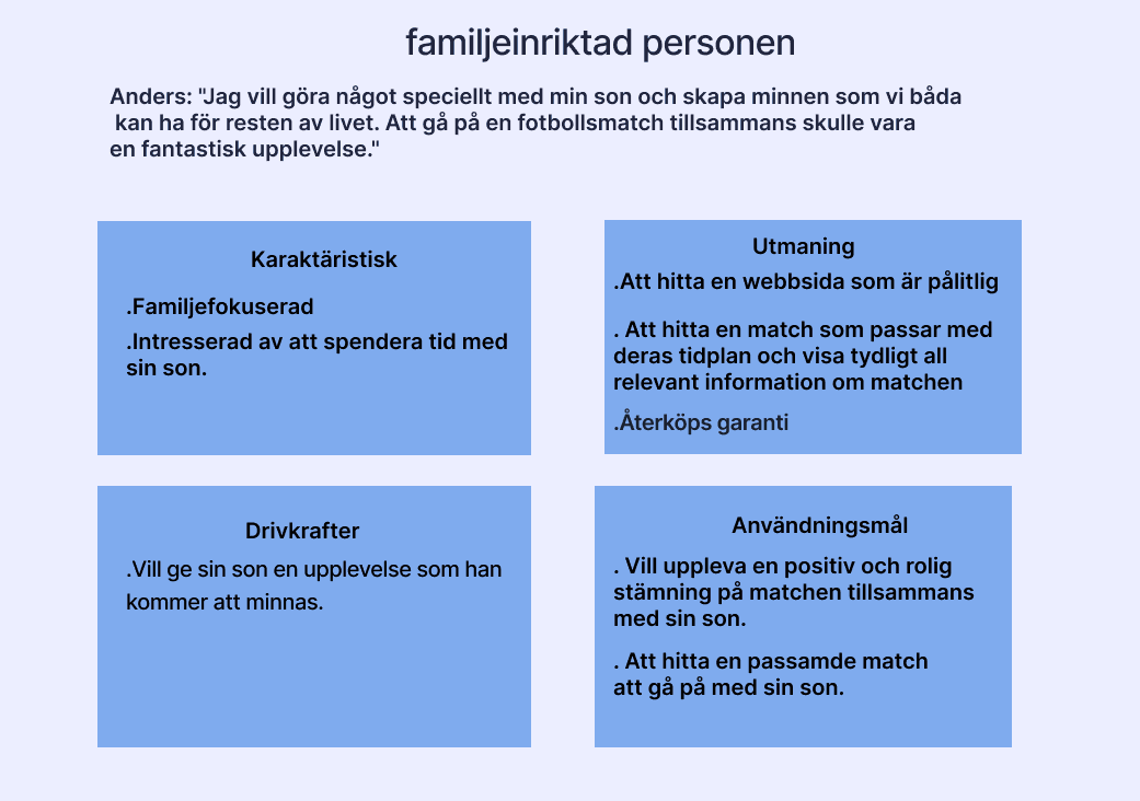
Behavior types


To understand the target group better and to get a clearer picture of the target groups, we decided to create 2 behavior types
To understand the target group better and to get a clearer picture of the target groups, we decided to create 2 behavior types
During this phase i used a user story map to prioritize and organize the desired functions of the project, ensuring a clear understanding of requirements, facilitating collaboration, and aiding in release planning.
During this phase i used a user story map to prioritize and organize the desired functions of the project, ensuring a clear understanding of requirements, facilitating collaboration, and aiding in release planning.
User story map
User story map
Prototype
Prototype
I created prototypes in figma, starting by creating Low-fi then we created hi-fi
I created prototypes in figma, starting by creating Low-fi then we created hi-fi
Low-fi prototypes
Low-fi prototypes
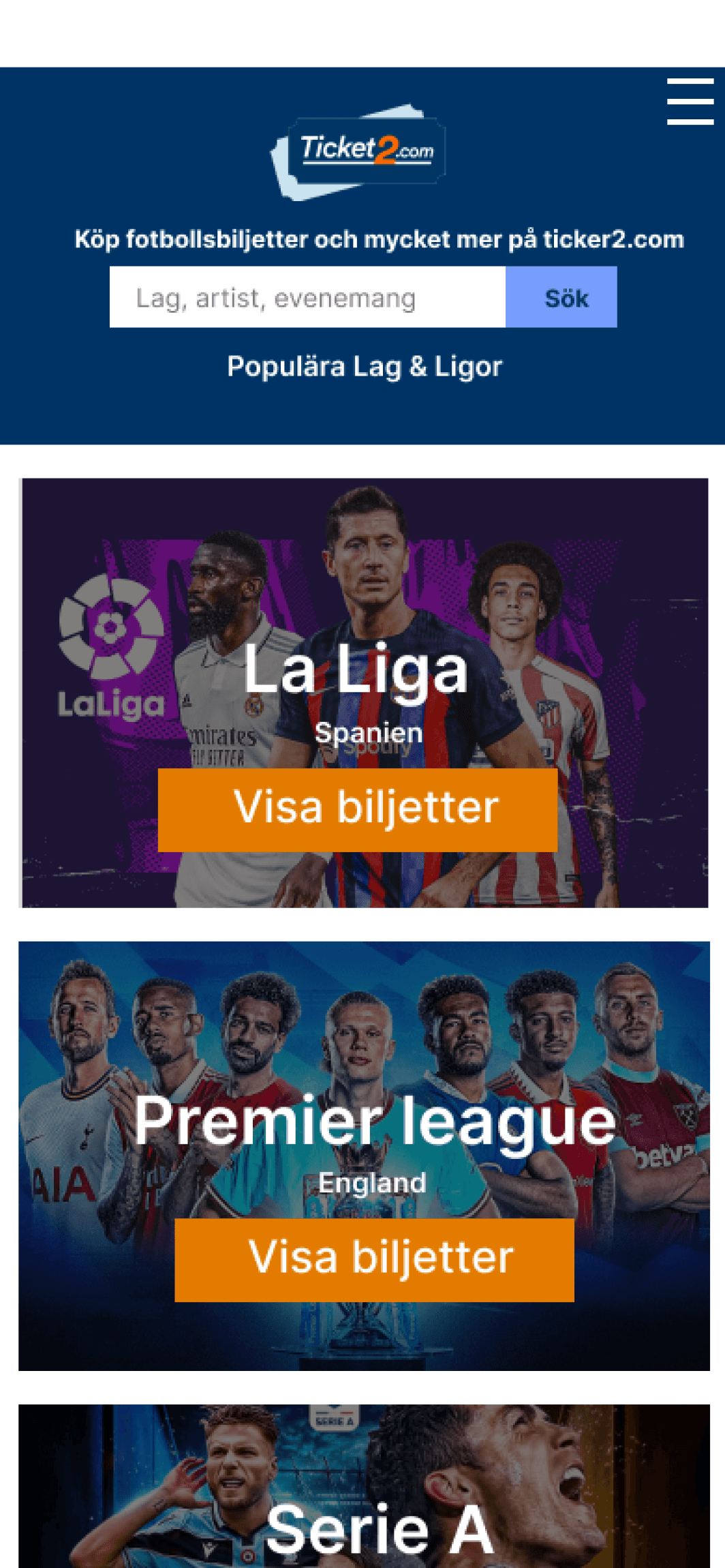
Hi-fi prototypes
Hi-fi prototypes
User testing - summary
Five persons participated in our prototype testing and task testing. They were requested to express their opinions on it
“I was impressed by Ticket2's visually appealing interface”.
“The search function on Ticket2 is impressive. It quickly helped me find the exact event tickets I was looking for”.
“The responsive design of Ticket2 made it accessible and easy to use on both desktop and mobile devices”.
“Ticket2's color scheme and overall design aesthetic created a sense of professionalism and trustworthiness. It gave me confidence in using the platform.”
“Ticket2 offers a wide range of secure payment options, including major credit cards and trusted online payment systems”.
User testing - summary
Five persons participated in our prototype testing and task testing. They were requested to express their opinions on it
User testing - summary
Five persons participated in our prototype testing and task testing. They were requested to express their opinions on it
User testing - summary
Five persons participated in our prototype testing and task testing. They were requested to express their opinions on it
User testing - summary
Five persons participated in our prototype testing and task testing. They were requested to express their opinions on it
“I was impressed by Ticket2's visually appealing interface”.
“The search function on Ticket2 is impressive. It quickly helped me find the exact event tickets I was looking for”.
“The responsive design of Ticket2 made it accessible and easy to use on both desktop and mobile devices”.
“I was impressed by Ticket2's visually appealing interface”.
“The search function on Ticket2 is impressive. It quickly helped me find the exact event tickets I was looking for”.
“The responsive design of Ticket2 made it accessible and easy to use on both desktop and mobile devices”.
“Ticket2's color scheme and overall design aesthetic created a sense of professionalism and trustworthiness. It gave me confidence in using the platform.”
“Ticket2 offers a wide range of secure payment options, including major credit cards and trusted online payment systems”.
“Ticket2's color scheme and overall design aesthetic created a sense of professionalism and trustworthiness. It gave me confidence in using the platform.”
“Ticket2 offers a wide range of secure payment options, including major credit cards and trusted online payment systems”.
Back Home
Solution
Insights
Result
Insights
Result
Conclusion
My Contributions
Customer Journey Map
Lack of Trust: Users did not trust the old website, which negatively impacted their willingness to use the platform.
Poor Usability: The website was difficult to navigate, making it challenging for users to find and purchase tickets.
Lack of visual appeal: The design of the app is not visually appealing, and it does not engage users.
Problem Identification
Surveys: Surveys were conducted to get a better understanding of the user's pain points
Competitor Analysis: To find best practices in the industry, a UX analysis of other websites was carried out.
User testing: The website was tested with a sample group of users to observe their behavior and identify areas for improvement.
User Research
Behavior types
To understand the target group better and to get a clearer picture of the target groups, we decided to create 2 behavior types
During this phase i used a user story map to prioritize and organize the desired functions of the project, ensuring a clear understanding of requirements, facilitating collaboration, and aiding in release planning.
User story map
During this phase, i created flowchart. The flow that was scheduled depicted what a customer journey looks like when they are purchasing a match ticket.
Customer Journey Map
Trust Issues: Users reported feeling insecure about using the old website due to its outdated design and lack of clear security features.
Navigation Difficulties: The old website’s navigation was not intuitive, leading to frustration and difficulties in finding tickets.
Attractiveness: The users found the current design of the website to be unappealing and lacking in visual appeal.
Insights
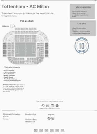
Hi-fi prototypes
The changes made to the Ticket2 website greatly improved the user experience. The new navigation is easier to use, making it simple for users to find and buy tickets. The updated design looks more professional, which helps build trust with users. The checkout process is now faster and simpler
Result
This case study shows how important it is to focus on user experience for online platforms. By understanding what users need and want, Ticket2 was able to redesign its website to be more user-friendly and trustworthy. This project highlights that ongoing user research and design improvements are key to the success of an online ticket marketplace.
Conclusion
Want to work together?
Nshteh01@gmail.com
If you like what you see and want to work together, get in touch!
Back Home
Lack of Trust: Users did not trust the old website, which negatively impacted their willingness to use the platform.
Poor Usability: The website was difficult to navigate, making it challenging for users to find and purchase tickets.
Lack of visual appeal: The design of the app is not visually appealing, and it does not engage users.
Problem Identification
Surveys: Surveys were conducted to get a better understanding of the user's pain points
Competitor Analysis: To find best practices in the industry, a UX analysis of other websites was carried out.
User testing: The website was tested with a sample group of users to observe their behavior and identify areas for improvement.
User Research
Behavior types
To understand the target group better and to get a clearer picture of the target groups, we decided to create 2 behavior types
Trust Issues: Users reported feeling insecure about using the old website due to its outdated design and lack of clear security features.
Navigation Difficulties: The old website’s navigation was not intuitive, leading to frustration and difficulties in finding tickets.
Attractiveness: The users found the current design of the website to be unappealing and lacking in visual appeal.
Insights
During this phase, i created flowchart. The flow that was scheduled depicted what a customer journey looks like when they are purchasing a match ticket.
Customer Journey Map
During this phase i used a user story map to prioritize and organize the desired functions of the project, ensuring a clear understanding of requirements, facilitating collaboration, and aiding in release planning.
User story map
Redesigned Interface: Developed a new, visually appealing design that instills confidence and trust in users.
Improved Navigation: Simplified the navigation structure, making it easier for users to find and purchase tickets.
Responsive Design: Ensured the new design is fully responsive, providing a seamless experience on both desktop and mobile devices.
Solution
Prototype
I created prototypes in figma, starting by creating Low-fi then we created hi-fi
Low-fi prototypes
Hi-fi prototypes
The changes made to the Ticket2 website greatly improved the user experience. The new navigation is easier to use, making it simple for users to find and buy tickets. The updated design looks more professional, which helps build trust with users. The checkout process is now faster and simpler
Result
This case study shows how important it is to focus on user experience for online platforms. By understanding what users need and want, Ticket2 was able to redesign its website to be more user-friendly and trustworthy. This project highlights that ongoing user research and design improvements are key to the success of an online ticket marketplace.
Conclusion
Want to work together?
Nshteh01@gmail.com
If you like what you see and want to work together, get in touch!
Back Home